6 Indispensable Benefits of Modernizing your Work Process

If a company is stuck on archaic processes, they risk facing costly consequences.
— ITBusinessEdge

Estimated reading time: 4 mins

The beginning of a new year is the perfect time to evaluate your business and its ability to handle new challenges and opportunities.  A key factor to this process is ensuring that your methodology for getting work done is up to date. “To achieve the full benefits of mobile, cloud, data analytics and social media, a company’s mission-critical systems need to be agile and open enough to enable these new ways of doing business. That’s why modernization is so vital to today’s small to midsize businesses,” writes Joe McKendrick at Microsoft.  In some ways it doesn’t matter what the process is as long as you are achieving the results through a standard, repeatable process.

This article is the first in a series on modernizing your business.  Today, we’re focusing on the benefits of modernizing your work process.  By work process we mean a set of activities geared toward transforming input into valuable output.  Put another way, a work process is a collection of steps meant to culminate in something useful for your business. Work processes will naturally vary from company to company, but the principles behind developing a sound work process apply to all businesses that offer products and services to pharmaceutical companies.  

The benefits of a modern work process can’t be realized unless you have the right team evaluate your process.  An outside review of your business process, including how you develop new products and services, can be especially useful for learning how your process compares to others and where you can improve it.  

The Benefits of a Modern Work Process

1. Mindfulness

A modern work process forces you to be more mindful while completing tasks, even in the face of new distractions.  Instead of relying on sheer willpower to get things done, a good work process should organize and direct your steps so that you can more easily stay on track.  This type of approach also focuses on the big picture. Rather than putting out small fires throughout the day, your work process provides a roadmap for accomplishing what is critical to your goal.

2. Efficiency

Businesses that have modern work processes in place can reduce costs and increase productivity by eliminating redundancies and increasing cost-saving measures such as automation.  On the flip side, an inefficient work process can wreak havoc on your output.  “Bad workflow cripples your team: it makes it less efficient and team members end up frustrated. It means you deliver worse work slower, don’t keep clients or stakeholders as happy as they should be, and lose money,” notes Frederik Vincx.

3. Agility

Along with increased efficiency, a properly modernized work process will enable your business to remain adaptable and able to interface with other modernized companies in new ways.  Tools like cloud-based computing, remote collaboration, social media, and multi-channel communication save time and money while increasing flexibility.  A modernized business has the agility to take on new projects and responsibilities better than its out-of-date competitors.

4. Collaboration

Team members are critical to the success of most businesses yet are often overlooked when developing new or updated work processes.  A modern work process takes into consideration staff to ensure that everyone is on the same page, understands the big picture, and knows what is expected of him or her.  Modern work processes enable team members to focus on project outcomes instead of getting bogged down by endless administrative and menial tasks.

5. Measurability

Successful work processes can be evaluated and improved upon because they are measurable.  Forbes contributor Dan Woods notes, “If [your work process] is carefully designed, you can start measuring what you are doing, make incremental adjustments and optimize your operations. Without well-defined processes, how can you really improve systematically?” Diligently documenting your work process allows you to evaluate and refine it.

6. Consistency

If your business cannot consistently create valuable output, a modern work process can help. When an effective process is in place, “each task is executed the way it was planned and designed. Identical problems are addressed the same way and there is no need to reinvent the wheel,” writes Stephanie Famuyide. In the same vein, modernized work processes can detect and overcome inconsistencies in your business.  

Pharmaceutical Industry Considerations

Though much of the pharma industry is centered around the inherently slow process of moving from R&D to public offering, having a modern work process in place can help your company provide better products and services to pharma companies.  Here’s how:

1. Innovate

Marketplace shifts like healthcare reform or changes to Medicare Part D require the ability to develop products and solutions that meet new challenges.  A modern work process can increase innovation by speeding your new product development and launch process.  

2. Adapt

Your company likely has assets in place that were developed for a specific purpose.  When the market changes, those assets must change with it or risk becoming liabilities. A modern work process can help you adapt those assets for continuing sustainability as well as for a broader application than originally intended.

3. Regroup

A modern business process enables your company to more quickly and efficiently deal with setbacks.  Because you have a framework in place to create or adapt assets, you can more easily regroup and pivot when a setback arises without having start again from scratch.

4.  Compete

A company that keeps pace with current technologies and methods of accomplishing tasks will also have a competitive edge over companies that don’t.  This is especially true when it comes to increasingly-popular cost-saving methods like automation and data-driven decision-making. Technology that lightens the load of administrative tasks can free you up to handle important business matters or save you the time and expense of hiring additional personnel.

How Effective is your Work Process?

Does your company have an effective, modern work process in place? Effectiveness can be measured in the number of new services offered, new clients gained and the effort to develop new offerings. Over the past 25 years, we’ve helped businesses that serve pharma companies develop work processes that have successfully moved dozens of products to market.  Our process is to do a quick, internal interview to identify issues and propose ways to improve workflow especially around developing new services you can offer your clients. We have found that increasing your proactive approach to designing new solutions is a key growth of existing and new clients. If your company’s work process could use some outside perspective, contact us today.


5 Most-Read Blog Posts of 2016

Estimated reading time: 2 mins

Like most companies, we at Pharma Acumen took time to reflect on the successes and challenges of 2016 to help shape our strategy and goals for 2017.  As part of that process, we reviewed our blog to find the most-read posts last year.  Compiling this list was thought-provoking; it gave us a chance to look back on projects that inspired blog posts as well as new ideas that arose from our research.  More importantly, our review of 2016 helped us get a feel for the types of posts our readers found most useful and would want to see in the upcoming year.

1) Five Ways Data Visualization Enhances Client Projects

If your business isn’t successfully integrating data visualization into output for clients, you’re missing an opportunity to provide valuable insights.  “For all the data that’s being created by people, machines, Internet-enabled devices, and other sources, data doesn’t provide executives and other decision makers with valuable insights on its own. The data must be gathered, organized, made interpretable, and then analyzed and acted on to provide any meaningful value.”

2) Obstacles to a Successful Product Launch

Does your business plan on launching a new product in 2017? If you have a new product on the docket and want to ensure its success, it’s important to learn from the failures of others.  In this post we explore nine main reasons product launches fail and how you can avoid these mistakes in your own launch.

3) Bootstrap or Investor Funding?

It’s no secret that starting your own company requires funding.  Your options boil down to two main sources: bootstrapping (or footing the bill yourself) or investor funding (taking outside capital).  But, which option is best for your startup?  Our post highlights what you should consider when determining how to best fund your startup.

4) 12 Signs your Business Needs a Reality Check

“Surviving a failure gives you more self–confidence. Failures are great learning tools… but they must be kept to a minimum.” Is your business on a collision course with failure? If you aren’t consistently evaluating your business, you may miss internal indicators that your business is in trouble. These 12 signs can help you assess whether your business needs some help and where to turn if it does.

5) How to Identify a Gap in the Market

2016 saw the launch of some interesting new products and tools, ranging from Google Home to the wildly successful revival of Pokemon.  For each of these launches, someone saw a gap in the market that could be profitably filled by his or her idea.  Does 2017 contain a gap in your target market that your business could fill?  Our blog post lists six ways to determine a gap in your market and how to take advantage of that gap.

What was your favorite post of 2016?


4 Reasons to Harness Data Visualization for your Pharma Company

A picture is worth a million rows.
— Tableau Software

Estimated reading time: 4 mins

In our last post, we saw 6 exceptional examples of data visualization.  For businesses that work with pharmaceutical companies specifically, data visualization is often lacking or not utilized at all.  Yet, as we have seen, visuals can be critical for both making sense of the sheer volume of data available and enabling your audience to access data.  

The pharmaceutical world has its own set of data challenges. For one, the types of data involved vary.  Whether dealing with highly technical drug research or prescribing trends among millions of HCPs or the impact of changing legislation on access to prescriptions, pharmaceutical data is vast and complex.  Without a strategy for translating data into usable material, important information could remain obscured.  As Michael Price notes, pharma companies are tasked with bringing “to life the data behind our brands. Better put, we are asked to communicate complex stories in a way that is facile and succinct.”  

Here are four ways to put data visualization to use for your company.

1. To Understand the Marketplace

Before you begin shaping data for customer use, it’s important to understand your place in the market.  Your own internal data visualization can help you evaluate the market your business serves.  Whether it’s determining the right time to develop a new product or detecting emerging trends, data visualization, if done well, can help you generate insights critical to your company’s success.

Here’s an example of raw data versus visualized data.  The table below contains figures on research spending by top pharmaceutical companies.  Though simple and containing relatively little data, this table makes it difficult to quickly determine the extent to which drug spending differs from company to company.

Source: Forbes

However, when this information is represented graphically, it becomes obvious which drug company spends the most on R&D overall.  Viewers can also navigate between two other visualizations to learn how much companies spend on average per drug and how many drugs each company has developed.

Source: http://infogr.am/Total-Pharmaceutical-R

This information is much more powerful when visualized because the numbers become tangible.  It’s easy to get the big picture without wading through dozens of mind-numbing figures.  

2. To Ask the Right Questions

In order to understand data, it’s important to ask the right questions of it.  This can get tricky, though, when you’re not quite sure what those questions should be.  Data visualization can help you hone in on the right questions by displaying the results of the questions you asked and inviting evaluation of how information is represented visually.

For example, let’s say a client asked us to improve upon this graphic:

While the chart is simple, it isn’t clear.  What’s the point?  Who is the intended audience?  What insights are we supposed to glean from this information?

Re-visualizing the data helps answer some of the questions raised by the first graphic.  Displaying the same information in a different format, adding color coding, and summarizing the main point upfront all help to clarify the message of this chart.   However, while better than the first, this graphic doesn’t quite capture what the client is trying to communicate or fully answer the questions raised.

The last graphic effectively pinpoints what the client is trying to communicate without complicating interpretation with irrelevant information.  After some trial and error, the client realized that the main point of the graphic was to demonstrate the percentage of patients who take their medications as prescribed.  By visualizing the data provided, we figured out which questions needed to be asked of the data so that we could communicate the client’s message simply and powerfully.

Example and data are fictional; graphics adapted from Evergreen Data

3. To Make Information Accessible to a Broader Audience

The ability to make vast amounts of data understandable to a wide audience is one key benefit of data visualization.  This is especially true in the pharmaceutical world where complex data drives costly decision making.  Good data visualization can bridge the gap between the highly-specialized information coming from labs and the boardroom executives who must interpret those results and decide how to proceed.  Michael Spitz helpfully points out that, “At their heart, effective visualizations simply and immediately convey a dramatic story or make a convincing point.”

Take for instance the following table on prescription drug spending in 1960 and 2014.

The information is fairly straightforward.  But, when visualized, it becomes more clear what percentage of total spending each payer was responsible for and the vast difference between 2014 and 1960 in terms of responsible payers.

This graphic demonstrates the difference between 1960 and 2014 in terms of the prescription drug market size.  While it’s easy to note that the prescription market of 1960 is about 1% of the size of 2014’s market, the impact increases when this information is portrayed graphically.

Adapted from data and visualization at CHCF

4. To Enable People to Interact with your Data

One of the more recent benefits of data visualization is that data can come alive in ways that were previously impossible.  Newer data visualizations are interactive, allowing users to change factors that impact the data displayed and the expected outcomes of certain decisions. This is especially useful in an era where the amount of data available is astronomical, and growing.  A well-made data visualization can distill massive amounts of data into one key insight.

A good example of pharma-specific data visualization comes from PricewaterhouseCoopers and their Pharma2020 data analysis.  The original information in their report is comprised of nearly 1,000 pieces of raw data and looks like this:

To enable users to better understand and interact with their data, PwC created an interactive map that offers comparisons between dozens of countries across different factors such as projected population, economic indicators, and personal affluence.  The ability to evaluate several counties side-by-side allows users to quickly identify differences and commonalities. This makes it easier to get the big picture, draw insights and make informed decisions.

Source: PricewaterhouseCoopers

How do you stack up?

Is your own own data visualization persuasive and compelling?  How well does it communicate your message?  Are you maximizing the value of your data-driven products?

We have helped clients successfully leverage the power of data visualization for their pharmaceutical businesses.  Whether you need to improve upon existing graphics or develop visualizations from scratch, we have the tools in place to create compelling data visualizations that get results.  Contact Brian to learn more about how our data visualization services can take your data to the next level.

Continue exploring the power of dataviz:

6 Stunning Examples of Data Visualization

 
“If a picture is worth a thousand words, a data visualization is worth at least a million.”
— Allison Stadd

Estimated reading time: 3 mins

We’ve spent the last few posts exploring data visualization and its benefits as well as mistakes to avoid.  Perhaps the best way to learn about data visualizations is to see real-life examples of exceptional data visualizations that are aesthetically pleasing and convey information well.  Below you’ll find visualizations that we think fit the bill along with our thoughts on what makes them great.

1. The Hollywood Insider

This interactive visualization cleverly portrays the success of every major movie between 2008-2015.  The brilliance of this design is that it is sortable by different factors, color coded by genre, and sized by revenue.

2. The Daily Routines of Famous Creative People

Ever wondered how many hours Picasso slept or Benjamin Franklin spent socializing?  This data visualization displays the routines of some of the world’s most famous creative talent.  You can sort by type of activity to see how each individual compares to his or her peers or take in the whole graphic at once.  What makes this visualization work well is the fact that it’s organized hourly and uses colors to clearly indicate the activity of each person.  It’s easy to compare and contrast routines for everyone on the list.  What would make this work even better would be a function that compares only select individuals.

3. Causes of Death in Shakespeare’s Plays

The genius behind this infographic is that it harnesses a popular method of data visualization to depict the most frequent ways Shakespeare chose to have his characters die.  The original graphic was a pie chart with more than 20 different slices, many representing just one way Shakespeare chose to slay his characters.  The word cloud provides an easy-to-read alternative to a complex pie chart.  One drawback is that the colors of the words seem to be random; assigning meaning to the colors would improve the word cloud.

dv4.png

4. Where the Wild Bees Are

If you think you’re looking at a beehive, you’re right.  But you’re also looking at an infographic that maps bee-plant interactions for the last 120 years.  While this chart is a good example of form over function (there’s no legend for plant types, for example), it is a world above the complex scientific graph created to convey the same information.

dv4.1.png

5. Why Peyton Manning’s Record Will Be Hard to Beat

In 2014 Peyton Manning broke Brett Favre’s record for career touchdowns; stunningly, he accomplished this mark 56 games earlier than Brett Favre did.  To illustrate why Manning’s record will be difficult to break, this New York times data visualization reaches back to 1930 to chart quarterbacks with at least 30 career touchdowns.  Manning’s upward trajectory is all the more impressive when compared to quarterbacks over the last 100 years.  While the inclusion of so many quarterbacks helps to demonstrate Manning’s accomplishment, the chart is a bit tricky to navigate in places.

dv5.PNG

6. 13 Reasons Why Your Brain Craves Infographics

A clever company decided to use an infographic to demonstrate why infographics are effective.  The result is a webpage that ranks 4th on Google for interactive infographics and has garnered over 27,000 social shares.  This infographic is the perfect marketing tool for the company because it illustrates what they create (infographics), why it’s important to have a killer infographic, and the benefits of a good infographic.

dv6.PNG

As we have seen in this post and ones before it, data visualization can be a great tool to use to convey meaning, harness valuable insights, and add value for clients.  Data visualization can also backfire if done poorly.  Investing in the right resources, especially in the expertise of a seasoned industry veteran, is one way to ensure your company reaps the benefits of its data visualization strategy.  If you’re in need of expert input or market research for your data visualization projects, contact Brian to learn more about Pharma Acumen can help you.

Read more about effective dataviz:


President Trump and the Future of Pharma

Photo Credit: CNN

Photo Credit: CNN

Estimated reading time: 5 mins

With the surprising outcome of last Tuesday’s election now sinking in, perhaps the biggest question for the pharma industry is, “What now?”  Under a President Clinton, who had publicly supported Obamacare and carefully delineated a roadmap for the future, the direction of pharma seemed a bit more certain even if we didn’t appreciate the movement toward Medicare negotiated prices.  While we, along with the rest of the country, don’t know exactly where President-elect Trump plans to take the pharma industry, we do have some idea given his party’s platform and hints he gave during his campaign.

Affordable Care Act

The ACA was one of the biggest issues Trump rallied against.  His website states, “Since March of 2010, the American people have had to suffer under the incredible economic burden of the Affordable Care Act...Obamacare has raised the economic uncertainty of every single person residing in this country.”  It’s clear that he plans to repeal and replace Obamacare, and sooner rather than later (as his plan for his first 100 days shows.)  According to Trump’s healthcare reform paper, “Our elected representatives must eliminate the individual mandate. No person should be required to buy insurance unless he or she wants to.”

Yet, despite his harsher rhetoric during the campaign, Trump’s position may be softening toward several key provisions of Obamacare.  Days after his election, Trump conceded that he likes the provisions forbidding insurances companies from denying coverage due to pre-existing conditions and allowing children to remain on parents’ policies for longer.  

In place of Obamacare, Trump may plan to allow insurances companies to compete across state lines, permit individuals to deduct health insurance premiums from their taxes, and promote the increased use of HSAs by making contributions tax-deductible and allowing holders to leave these funds to their next of kin without tax.  Trump has also argued for price transparency among healthcare providers. “Individuals should be able to shop to find the best prices for procedures, exams or any other medical-related procedure,” sites his website.  This may place more competition on local and regional plans consolidating more lives in large insurers.  In our opinion too much concentration in too few customers raises the stakes in Market Access Contracting and imperils pharma pricing.

Speaker of the House Paul Ryan’s healthcare plan, A Better Way, outlines the Republican plan for healthcare.  This includes ideas like tax credits for those without employer-offered coverage, allowing small businesses to band together for more purchasing power, and supporting wellness programs.  Ryan’s program also promises to accelerate drug discovery and improve the use of EHRs.  If Trump’s reform is able to achieve higher coverage rates, that will be a positive.  High deductible health plans will continue to be a challenge for companies with chronic condition therapies as patients may have a cash crunch early in the year that impacts their ability to pay for chronic therapies until their deductibles are met.

Drug Costs

To combat the rising price of prescription drugs Trump plans to lift restrictions on drug imports.  “Allowing consumers access to imported, safe and dependable drugs from overseas will bring more options to consumers,” says his website.  

We can also expect the new administration to push for increased transparency in setting drug prices, rebates, and copays.  “Policy makers also are looking for more disclosure of the role of pharmacy benefit managers (PBMs) in shaping prices and patient co-pays, as manufacturers and insurers both point fingers at these operations for failing to pass on savings from discounts to patients,” notes Jill Wechsler at PharmaExec.  We see danger for the future of copay programs from new policies.

Amid demands for the FDA to approve drugs faster, Trump’s plan could lead to more drug approvals and modernized review as FDA user fee programs are renegotiated. According to his plan, “There are over 4,000 drugs awaiting approval, and we especially want to speed the approval of life-saving medications.”  The potential to modernize the approval process could have positive implications for manufacturers in speed and lower costs.

Yet, Wechsler contends that despite Republican complaints about drug prices, “Sweeping changes are not likely in the near future. That will leave time for biopharmaceutical companies to build the case for continued investment in new important therapies, and for the adoption of value-based reimbursement models that better fit the broader shift to insurance and payment plans based on value and quality of care.”

Despite the relatively uncertain direction of a Trump administration, pharma stock prices soared following his election on the expectation that Trump and a Republican Congress would reduce government regulation on drug prices.

Value-Based Payments

Trump’s presidency may jeopardize the still-burgeoning value-based payment system.  As Fred Bazzoli notes, “Many value-based care initiatives came into being as a result of the ACA, so it’s unclear which, if any, of the nascent efforts to study new reimbursement mechanisms will survive any efforts to scale back the 6-year-old ACA.”  Others contend that Trump’s election won’t hamper value-based initiatives.  “It is entirely likely that leaders in the private sector will push forward with cost savings and innovative treatment,” says Jeff Smith, vice president of public policy at the American Medical Informatics Association via FierceHealthIT.  

The move to value-based care is likely too far along and too valuable to scrap altogether and MACRA legislation may not get wrapped in the “ACA repeal” movement.  However, early-stage and future value-based payment systems that rely on provisions in Obamacare may be endangered under a Trump administration.

Insurance Mergers

In July, the Justice Department announced its intent to block the mergers of Anthem and Cigna as well as Aetna and Humana.  “If allowed to proceed, these mergers would fundamentally reshape the health insurance industry. They would leave much of the multitrillion-dollar health insurance industry in the hands of three mammoth insurance companies, drastically constricting competition in a number of key markets that tens of millions of Americans rely on to receive health care,” said U.S. Attorney General Loretta Lynch.

However, with the election of Donald Trump, it’s unclear whether the Justice Department will do an about face and allow these two mergers.  His vow to allow insurance companies to do business across state lines may open the door for increased competition (and lower prices) but also makes it more likely that he will allow the market to shape mergers (and not the government).  

Proposition 61

With the defeat of Proposition 61 in California on election night, big pharma scored a win against price controls on drugs. According to Fortune, “The drug industry successfully swatted down California’s Proposition 61, a ballot initiative that would have capped how much the state’s public health programs pay for medicines at the same level the Department of Veterans Affairs (which receives deep discounts on treatments) shells out for them.”  The industry spent more than $100 million to fight the proposition, a formidable sum.

While the proposition itself would have affected a relatively small number of California residents, it would have set a precedent for limiting pharma’s pricing freedom.

Hospitals

While pharma stocks rose following Trump’s election, hospital stocks fell presumably because of Trump’s promise to repeal Obamacare (and possibly endanger health insurance for millions).  Some remain hopeful of the future for government-backed health care. “The ACA has added coverage for 20 million people. That's good. It's good for the 20 million people, and it's good for our industry. I don't think that's going to be easily undone, nor should it be," says Alan Miller, chief executive of Universal Health Services via The Philadelphia Inquirer.  But others worry that while Trump may have difficulty wrangling enough legislative support for repealing Obamacare, he may be able to undermine the program by defunding it.  Uncompensated care is a key drain on hospital budgets.  The potential impact on pharmacy budgets in hospitals may delay the adoption of new treatments.

Conclusion

While it’s not clear how President-elect Trump’s agenda will impact the pharma industry, it is clear that major changes are on the horizon.  We’re keeping our finger on the pulse of the government’s changing impact on the pharma industry and how that impact affects the bottom line for businesses that sell products and services to pharmaceutical companies.

5 Common Dataviz Mistakes to Avoid

Estimated reading time: 4 mins

We’ve seen in a recent post the benefits that effective data visualization bring to the table.  Not only do they improve deliverables for clients, they also help you understand the current market and better influence your audience.

The other side of the data visualization coin is that poorly executed graphics can be detrimental to the message you are trying to communicate.  The examples in this post demonstrate what happens when data visualization goes awry.  

1. Numbers Don’t Add Up

Though it might seem obvious, a mistake that’s all too common when using pie charts and part-of-the-whole graphics is including numbers that don’t add up to 100.  Here’s an example that comes from CNN:

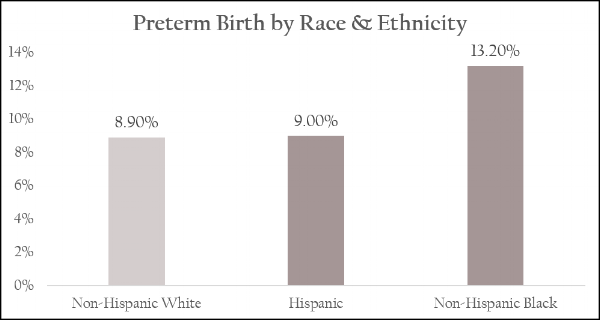
This chart is meant to communicate the fact that African American women are more likely than other women to deliver preterm babies.  But, these numbers are confusing when presented this way because the visual conflicts with the data included.  When looking at the pie chart, it appears that almost half of babies delivered preterm are African American, instead of 13.2%.

A simple bar chart is a better way to represent this information because it doesn’t skew the audience’s perception of the numbers.  It’s easy to read and clearly communicates the main point.

2. Too Complicated

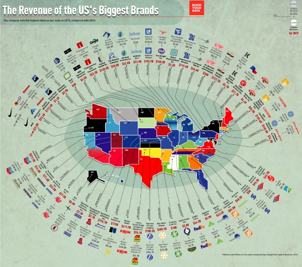
The beauty of data visualizations is their power to communicate information in a succinct and impactful way.  Sometimes, though, the complexity of a graphic far outweighs its ability to communicate successfully.  This infographic is a good example:

This visual is meant to provide information on the top most valuable brands across the world in 2016.  However, the amount information packed into this graphic along with the puzzling candy shop design choice make deciphering it, at best, difficult.  There seems to be no rhyme or reason behind the design or the way it’s organized.

Here’s another example of a visualization that is far too complicated:

The version below uses the same data but does a better job of communicating the main point (i.e. the most profitable company in each state) without any distracting additional design elements or information.

3. Skewed Correlation

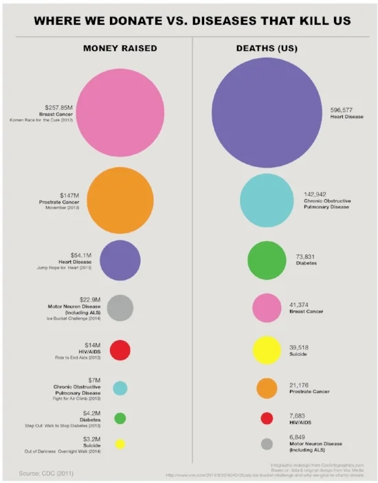
Visualizations of data communicate a message.  However, that message can be shaped to inaccurately represent the data being shown.  This example is meant to communicate the disproportionate amount of money donated to cure diseases in relation to the number of deaths caused by those diseases:

However, the circles sizes don’t correspond with the values shown.  As Randy Krum points out, “This is a false visualization and significantly exaggerates the smaller amounts of money contributed to each charity and the deaths attributed to each cause.”  

A reimaged version of this graphic by Krum more accurately depicts the relationship between money donated and deaths caused.

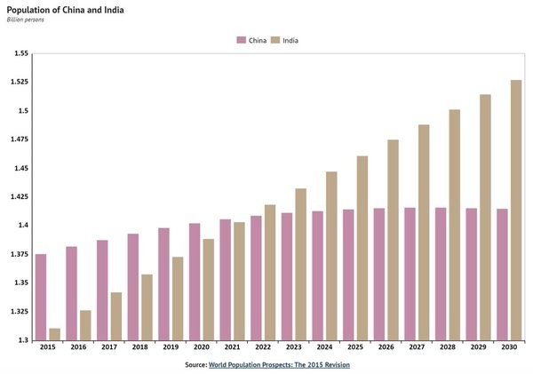
Another example of skewed correlation is this chart that depicts the current populations of China and India and projects expected changes over the next 15 years:

A quick glance makes it seem like in 2015 India’s population was ⅕ of China’s.  Because the x axis is truncated, the graph misleads its audience into thinking that China’s population is far larger India.  A corrected version of this graphic (with an x axis of 0) makes the effect less impressive and more accurately represents the data.

4. Omitting Key Information

Another common data visualization mistake is to exclude figures and other information necessary for understanding the graphic’s message.  The following example depicts the increase in oil production among several countries:

While it’s clear that the United had the largest increase in oil production, this graphic ultimately fails as a tool for helping the audience understand data because there is no data for us to understand.  Without any context, we have no way to tell whether the difference between increased production is very small or very large or insignificant.  Knowing by what percentage the US’s oil product increased, and how that percentage stacks up against other high-oil-producing countries would be a start.

“If you want to provide a fair picture of what’s going on, you have to expand your scope to show the variables that put things in their proper context. That way, you can provide your readers with a more complete and nuanced picture of the story you’re trying to tell.” Source

5. Not Sticking to Conventions

If the point of using dataviz is to make information easier to understand, bucking certain conventions may be detrimental to your efforts.  According to Kaiser Fung, “There should be a very high bar against running counter to convention. Readers do bring their ‘baggage’ to the chart, and the designer should take that into consideration.”  Take, for instance, this graphic depicting gun murders in Florida before and after the 2005 Stand Your Ground law was enacted.

At first glance, it seems that the new law significantly lowered gun deaths.  However, upon closer examination, we see that the designer here chose to invert the y axis, with the highest number at the bottom of the chart.  Unfortunately, this graphic backfired; instead of supporting the data, it nearly contradicts it by making the opposite appear to be true.

Are your data graphics conveying the right message or are they undermining your efforts? Whether you need expert advice on existing materials or are starting from scratch, we have the tools in place to help your company craft compelling visuals that generate insights.  Contact Brian today to learn more about what our data visualization services can do for you.

Keep reading about the value of dataviz:

15 Inspiring Quotes that Celebrate Entrepreneurship

Estimated reading time: 2 mins

Running your own business is tough.  Whether it’s working to get new clients, making sense of monthly financials, or developing new products, there are some days where there’s more work than hours available.  It’s easy to get bogged down by the daily grind or to lose motivation when you can’t quite make ends meet.

Thankfully, others have been there before, and succeeded despite difficult odds.  These 15 inspiring quotes celebrate the entrepreneurial mindset and remind us about the qualities needed to succeed in a challenging world.

  1. “One finds limits by pushing them.” – Herbert Simon

  2. “Even if you are on the right track, you’ll get run over if you just sit there.” – Will Rogers

  3. “You will get all you want in life, if you help enough other people get what they want.” – Zig Ziglar

  4. “Success is often achieved by those who don’t know that failure is inevitable.” – Coco Chanel

  5. “Yesterday’s home runs don’t win today’s games.” – Babe Ruth

  6. “I failed my way to success."  – Thomas Edison

  7. "A successful man is one who can lay a firm foundation with the bricks that others throw at him." – David Brinkley

  8. “A calm sea does not make a skilled sailor.” – Unknown

  9. “Out there in some garage is an entrepreneur who’s forging a bullet with your company’s name on it.” – Gary Hamel

  10. “Build your own dreams, or someone else will hire you to build theirs.” – Farrah Gray

  11. “There are no shortcuts to any place worth going.” – Beverly Sills

  12. “Success is the sum of small efforts – repeated day in and day out.” – Robert Collier

  13. “Don’t let the fear of losing be greater than the excitement of winning.” – Robert Kiyosaki

  14. "Don't be afraid to give up the good to go for the great.” – John D. Rockefeller

  15. "If you really look closely, most overnight successes took a long time." – Steve Jobs

Is your company headed in the right track?  Do you need expert guidance?  We have deep experience working with businesses that provide products and services to pharmaceutical companies.  Whether you need input on a product in the development stage, are looking to expand your offerings, or could benefit from an outside-in perspective, contact Brian today to learn more about how we can help you.

5 Ways Data Visualization Enhances Client Projects


Estimated reading time: 5 mins

Data visualization, the art of representing information visually, is not a new concept.  In fact, data visualization has existed for millennia in the form of paleolithic drawings, ancient maps, and star charts.  It’s only been fairly recently, however, as the amount of data has exploded that data visualization has become a popular tool for businesses.

Having access to data is critical for business success, particularly in a modern world where markets can shift at the drop of a hat.  But, raw data alone is not enough to drive business growth.  Instead, companies need to understand and be able to draw insights from that data.  Well-visualized data can facilitate this process.  As Brian Gentile notes, “For all the data that’s being created by people, machines, Internet-enabled devices, and other sources, data doesn’t provide executives and other decision makers with valuable insights on its own. The data must be gathered, organized, made interpretable, and then analyzed and acted on to provide any meaningful value.”

This is especially true for companies in the pharmaceutical industry, where data drives critical (and costly) decisions for drug development, patient engagement, HCP collaboration, and much more.  Below are 5 of the top reasons why harnessing data visualization can help your business.

1. Understand Text Faster

The human brain process visuals an astonishing 60,000 times faster than text.  When numbers are transformed into visuals, viewers are able to more quickly understand the information conveyed while retaining it better.  “Part of what helps us process visual information so well is that we can process multiple images simultaneously. With text, we just process one word at a time. When you think about it, that’s a pretty slow and inefficient process,” says Noah Parsons.  

This simple example demonstrates the efficiency with which the brain process visuals versus text-based information.

This principle is even more powerful when applied to complex information sets or vast amounts of data.

2. Grasp Information in New Ways

When data becomes visual, users are able to identify features that might have otherwise remained hidden.  “Important stories live in our data and data visualization is a powerful means to discover and understand these stories, and then to present them to others,” offers Stephen Few.  

One important aspect of gaining a new perspective on data is detecting emerging trends.  Using raw data alone makes it difficult to identify significant trends.  According to David White of the Aberdeen Group, companies who use data visualization are 28% more likely to detect emerging trends than those who rely on older methods of organizing and interpreting data.

Take for instance the following fictional data sheet depicting sales over the course of a year.  A quick glance makes it clear that international sales were lower than domestic sales.  But beyond that, it’s hard to ascertain any other patterns or trends.

When the same information is represented visually, several key insights become clear immediately.  The first is the extent to which domestic sales exceeded international sales.  Additionally, an up and down cyclical pattern for domestic sales emerges.  It’s also clear that domestic sales trended upward, despite several downturns.  Outliers, such as the August figure for international sales, are also readily apparent with visualizations.

3. Create Value for Clients

Data visualization enables businesses to create more value for their clients.  Instead of offering static numbers, businesses can shape how the data is represented, enabling their clients to better understand the numbers and empowering them to make informed decisions.   “Information, and the ability to decipher and act on it swiftly, has become a competitive differentiator. To identify new business opportunities ahead of the market, business leaders require the ability to access, evaluate, comprehend, and act on data faster and more effectively than ever before,” says Gentile.

This outside-in perspective harnesses data visualization techniques and tools to significantly increase clients’ ability to understand critical information that might otherwise remain hidden in data.  “Data visualization enables users to receive vast amounts of information regarding operational and business conditions. Data visualization allows decision makers to see connections between multi-dimensional data sets and provides new ways to interpret data,” continues Gentile.

This example, modified from the U.S. Census Bureau’s website, illustrates the wealthiest counties in the country.  When studying the data set, it’s clear that four counties in Virginia and three in New Jersey account for 7 of the 10 top ten wealthiest counties.  What’s not clear from the numbers is the geographical relationship of these counties.

When this data is represented using a simple visualization, it becomes clear that the two sets of the wealthiest counties are in close geographical approximation with each other.  It also becomes clear that those counties lie just outside two major metropolitan areas (Washington, D.C. and New York City).

This type of analysis offers clients insights that go beyond mere presentation of numbers.  Instead, clients can get a better understand of the situation at hand and their options through interpretation of the data.

4. Tell an Impactful Story

Data visualization enables companies to use data to tell stories that impact audiences.  As a white paper by Tableau argues, “Stories bring life to data and facts. They can help you make sense and order out of a disparate collection of facts. They make it easier to remember key points and can paint a vivid picture of what the future can look like. Stories also create interactivity—people put themselves into stories and can relate to the situation.”

The two examples below tell the same story about the relationship of the measles vaccine to the number of outbreaks.  

Measles vaccine was licensed in the United States in 1963. During 1958-1962, an average of 503,282 measles cases and 432 measles-associated deaths were reported each year. Measles incidence and deaths began to decline in 1965 and continued a 33-year downward trend. This trend was interrupted by epidemics in 1970-1972, 1976-1978, and 1989-1991. In 1998, measles reached a provisional record low number of 89 cases with no measles-associated deaths.
— CDC website

The text version of the story is dry, using numbers and facts to convey information.  While it’s clear that the measles vaccine significantly reduced the number of outbreaks, it’s difficult to grasp the magnitude of measles outbreaks until we see the information represented visually.  The heat map distills megatons of raw data into a relatively simple but very powerful graphic that tells the same story but in a more vivid and memorable way.

5. Persuade Your Audience

Similar to our point above, data visualization is more persuasive than raw data alone.  

“Unique and truly compelling visualizations are an underused, yet devastatingly effective tactic. They are equal parts rare and in demand. They beg to be shared. They are a catalyst for conversation, awareness, and action,” says Adam Singer.

Take for example the statistic that the United States imprisons more than 5 times as many prisoners as most founding members of NATO.  Then compare that statistic to the chart below.  The impact of the chart far surpasses that of the statistic alone because it drives home the extent to which incarceration rates differ. “The immediate, visceral reaction we have to charts like this one...is no accident. Visual perception research has established the fact that visual information is powerfully and inescapably persuasive in a way that text and speech aren’t,” says Scott Berinato.

Courtesy of HBR

Courtesy of HBR

Whether you need your data to tell a story or provide additional value for clients, it’s clear that data visualization facilitates the communication process and enables businesses to tell compelling stories.  

Using Data Visualization in Your Business

How can you harness the data you create for use with customers? Are you providing data or insights?  Would visualization of your data provide more value to your clients than data alone?

We have been working to build a routine process to use with our clients to audit existing deliverables and systematically find the best visualization of the data to provide to clients.  Sometimes we work directly with customers and other times we coach an account management team on how to move toward more visualization and the insights visualization can provide.  Contact Brian to learn more about our data visualization services and how they can help your business.

Read more about the value of data visualization: